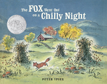
 Written and illustrated by Peter SpierOriginal 1961 DoubledayRefreshed Illustrations 2014 DoubledayAccording to a January 22, 2015 article in Publishers Weekly, Doubleday has revived five of Peter Spier's classic picture books "with refreshed art... new covers by the artist, and a uniform title typeface." The books are We the People, The Star Spangled Banner, Noah's Ark,The Book of Jonah and The Fox Went Out on a Chilly Night.It's the last book that interested me the most. It's an illustrated version of the old folk song. Maybe you've heard Burl Ives sing it. It was a favorite of one of my nieces, so I was so happy to find out that Doubleday asked Peter Spier to "refresh" his illustrations by adding color to the black and white spreads. When the book was published in 1961 full color in a picture book was expensive and so you'd have these half color/half black and white books. Normally, I'm not too thrilled about "colorization." I enjoy black-and-what for what it is. I echo what Orson Welles supposedly said about his masterpiece Citizen Kane: "Don't let Ted Turner deface my movie with his crayons." (Although, I like the legendary version of this quote: "Keep your damn crayons away from my movie.") Anyway, I am happy about Peter Spier's colorization of The Fox. No one else took their crayons to his artwork. And he did a wonderful job of bringing living color to his drawings.
Sometimes when an original illustrator plays a part in the reissue of a book he or she will create new artwork of the same images. Tomie DePaola said that his illustrations for the new editions of books like Nana Upstairs, Nana Downstairs look different from the original because he is a different artist and a different person now. Steven Kellogg made changes to his illustrations for The Mysterious Tadpole because there were "nuances of character, sequence and plot that [he] wish he had explored in the original version." * Spier said, "I do know if I had to do it all again, I'd do the books the very same way. I wouldn't know how to do them any other way!" In addition to the newly colored pages, the colored illustrations have been refreshed. "After so many decades of reprinting, the art's color had been degraded to the point that, though the story takes place in the middle of the night, it looked as though it was noon! And the black-and-white line drawings were so faded you couldn't make out the detail, which is one of Peter's hallmarks." It does make me sad to see the way subsequent printings degrade the color and clarity of some illustrations. However, I won't say that Spier's illustrations have been restored until I see a side by side comparison. (I hope I can find an original edition. If I do, I'll post a comparison here.) In the PW article, associate publishing director of Random House, Frances Gilbert said, "We also found an original edition of the book, and scanned the color art to make sure it was just right when we printed the new edition." I don't know if this means that they just scanned the original book to use in the new edition or they simply scanned it for comparison. I would think that scanning the original artwork would be best. But, I don't know much. I speak of these things simply as an observer. I look forward to seeing the spruced up Fox and hope that I can see new editions of his other works as well.
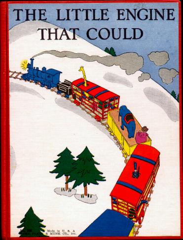
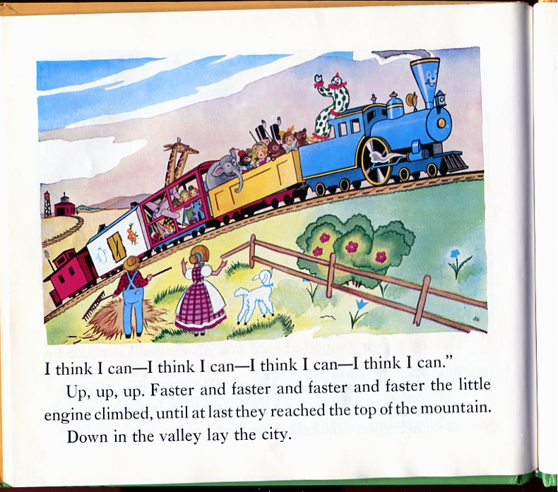
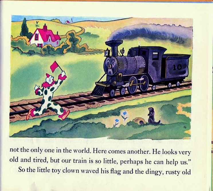
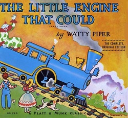 Some picture books have illustrations that have become iconic. No matter what reissues follow, people will always remember the original. The Little Engine that Could is one of those books. Right there on the front cover you see the claim: "The complete original edition." That, however, is not exactly true. According to Roy E. Plotnick, in his article "In Search of Watty Piper: A Brief History of the 'Little Engine' Story", the origin is a little hazy. Was it written by Frances Ford in 1910 for members of The After School Club, an educational organization in Philadelphia? Or did it come from a 1906 sermon by Methodist minister Charles S. Wing? Was the inspiration for the story actually The Good Samaritan? Read Mr. Plotnick's article for the details.
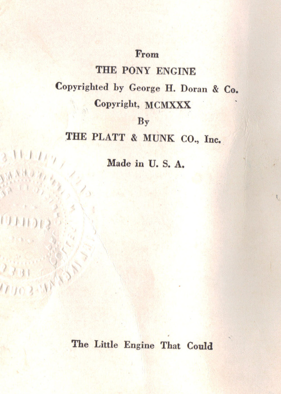
| The tale we're familiar with, written by "Watty Piper" (a pseudonym for Arnold Munk),
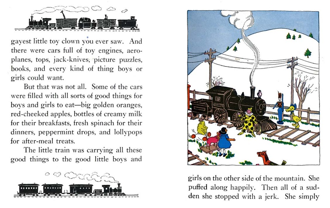
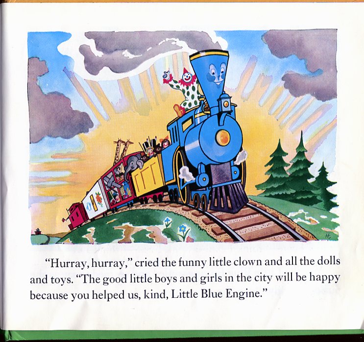
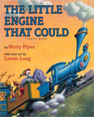
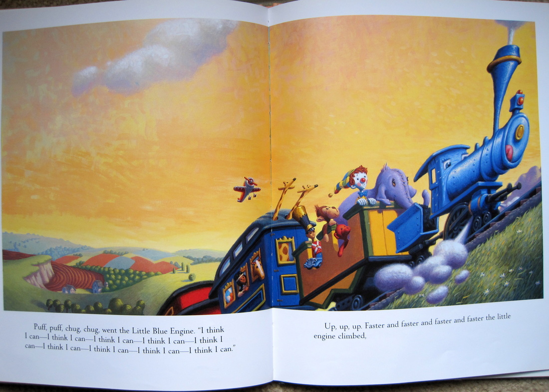
was originally illustrated by Lois Lenski in 1930. | | | | In 1954, George and Doris Hauman illustrated what has become the iconic version. The text is slightly revised from the 1930 edition, but the pictures set the standard for all versions to come. | In 2005, Loren Long illustrated an excellent new edition. Long re-imagines the little blue engine but keeps the coloring and flavor of the Hauman version.
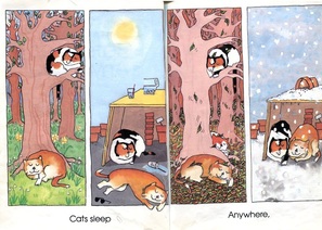
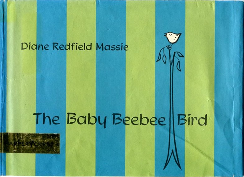
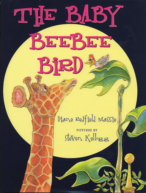
by Diane Redfield Massie
Original illustrated by Diane Redfield Massie, Harper & Row Publishers, 1963
Re-illustrated by Steven Kellogg, HarperCollins, 2000.
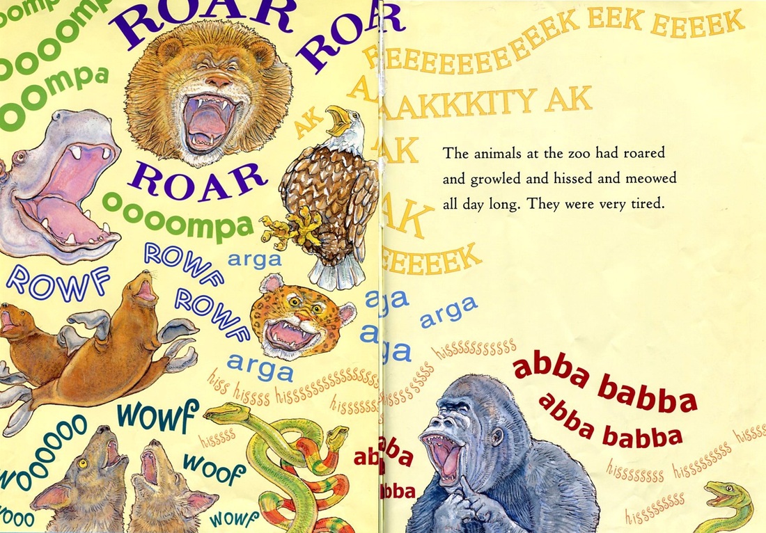
| I remember this story from my childhood, but I don't really remember the book itself. I think that I must have heard it read on Captain Kangaroo. Indeed, I found that it was featured in Season 9 - Episode 196, which was aired April 16, 1964. I only found the citation, not the episode, unfortunately.
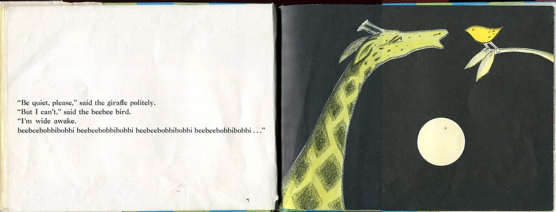
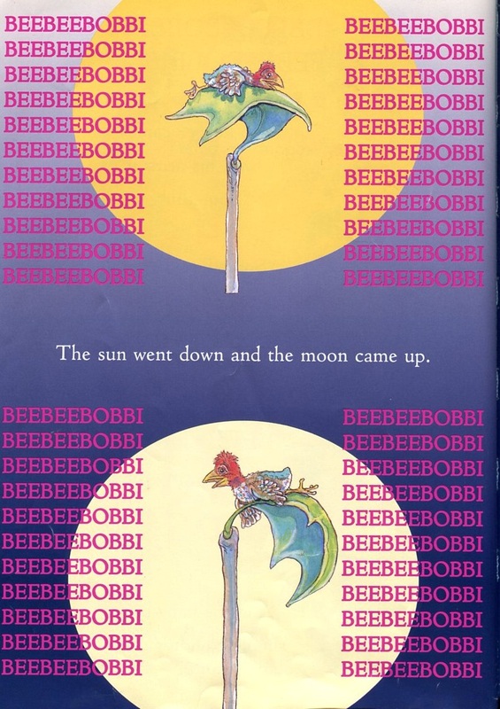
| | The story and charming words Massie used to tell the story make for such a great read-aloud that the illustrations almost don't matter. People tend to remember the bird's call of beebeebobbi beebeebobbiing more than the bird's appearance.
| That might be a good thing for Diane Redfield Massie. The new edition transfers "ownership," in a way, to the new illustrator, Steven Kellogg. It's not that Kellogg has stolen anything from Massie. His artwork is so iconic that from now on, when people think of The Baby Beebee Bird, they will think, "Oh, that's a Steven Kellogg book." The words, however, will always be Massie's.
| | But I could be wrong. Some of the comments on Amazon express a sadness for the loss of Massie's simple drawings:
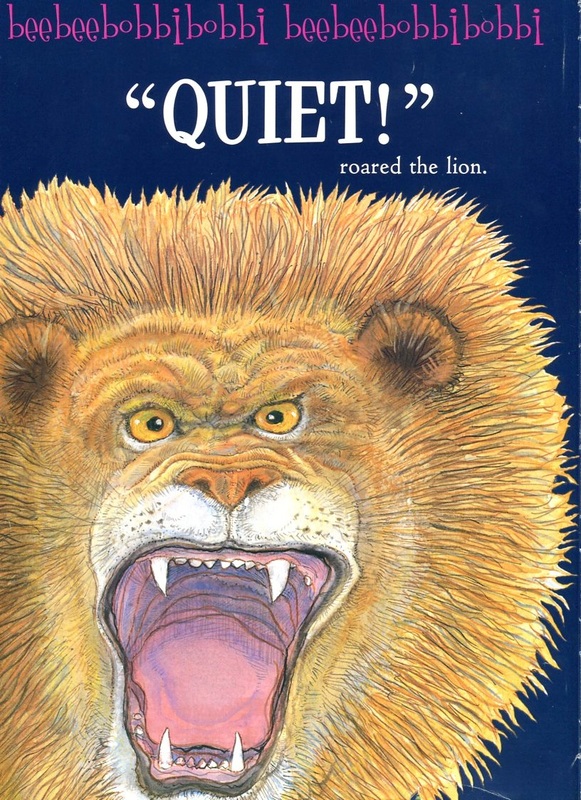
| "...the book has lost it's charm due to the, dare I say, bad ilustrations! The bird is not cute at all but rather frightening, as are the other animals and the text is not laid out well on the pages, making it difficult to read through." Amazon.com
| | Another Amazon reviewer says, "Also, I should say that ordinarily I love Stephen Kellogg, but well...YUCK! These pictures are garish and scary and sadly, they completely detract from the gentle and charming good humor of the original...I will look for a copy of the tiny, lovely one we had as kids."Amazon.com
| And another says, "I was very disappointed in the illustrations...Instead of a cute little round green bird, similar to ones we have here in Hawaii, the bird in this version is not cute at all, but kind of creepy."Amazon.com
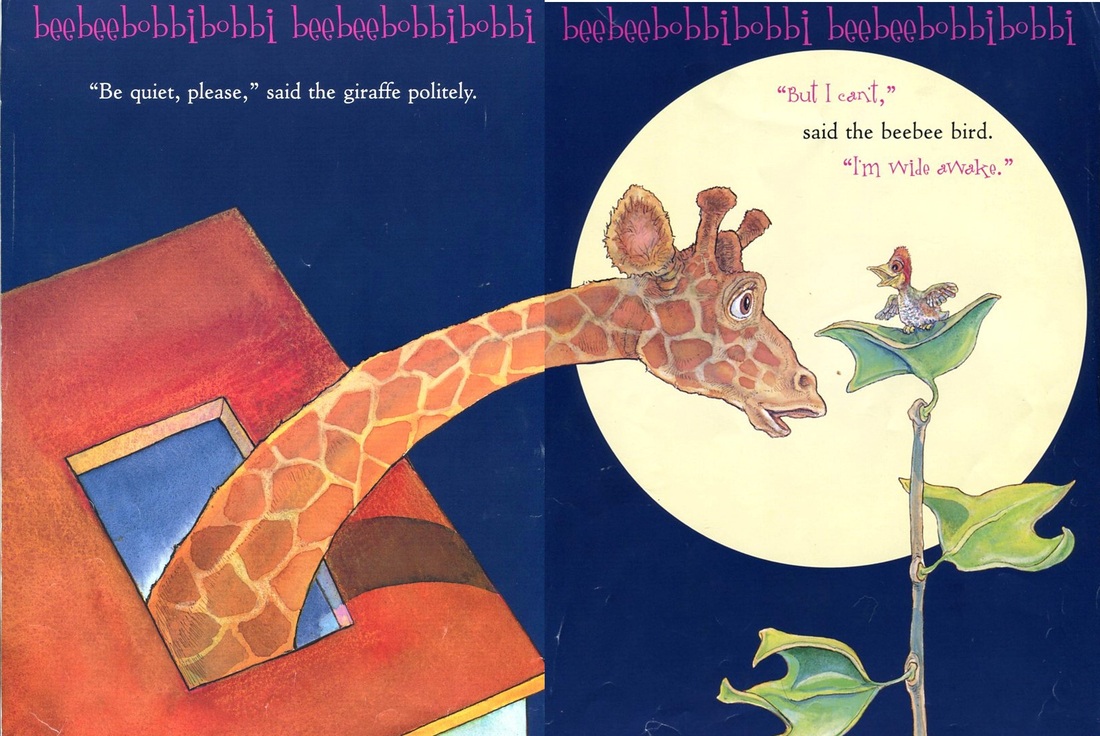
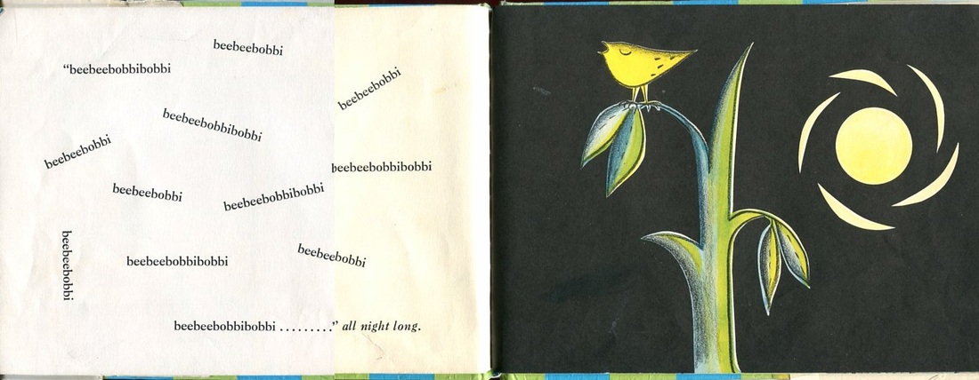
| | I agree that that original drawings are very charming. But I like the design of the newer version. The bird's "song" is printed along the top of each page, to emphasize how incessant it is.
| With all of the pairs of books I've looked at throughout this project, I've tended to like the older version better. In this case, however, I have so enjoyed sharing Steven Kellogg's version with groups of children who leave storytime chanting:
Beebee bobbi bobbi, Beebee bobbi bobbi,
Beebee bobbi, Beebee bobbi bobbi,
Beebee bobbi bobbi, Beebee bobbi
BeBeebee bobbi bobbi, Beebee Bobbi bobbi,
Beebee bobbi, Beebee bobbi bobbi,
Beebee bobbi bobbi, Beebee bobbi, Beebee
bobbi bobbi, Beebee bobbi bobbie, Beebee
bobbi, Beebee bobbi bobbi, Beebee bobbi....
| |
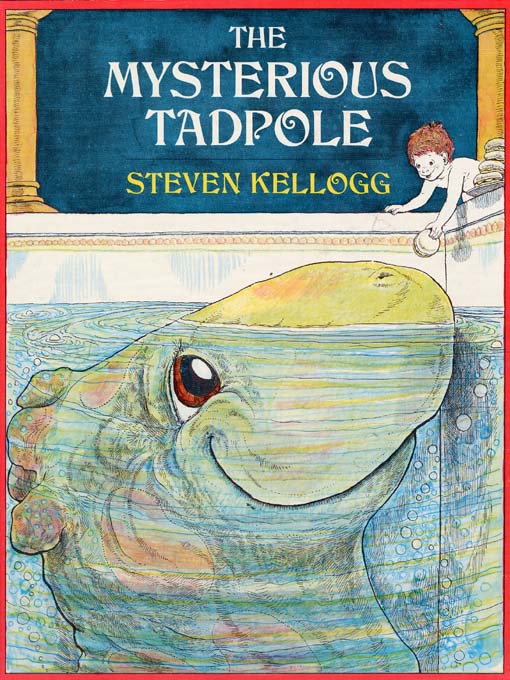
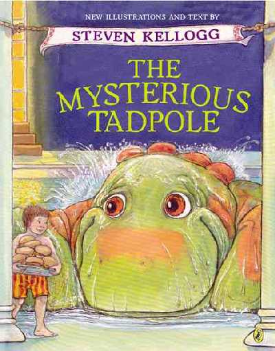
written and illustrated by Steven Kellogg
original: Dial Books, 1977
re-illustrated and revised: Dial Books for Young Readers, 2002
Steven Kellogg took a bit of a risk, in my opinion, in revising what has become a classic.
The revision is the 25th anniversary edition and is now a slightly larger book with vibrant color illustrations. Compare this to the original with its minimally colored drawings.
Steven Kellogg went beyond simply re-illustrating the book, however. His editors suggested the revision and he “eagerly accepted the invitation.” In A Note from the Author in the back of the new Mysterious Tadpole Mr. Kellogg writes, “With the passing years I realized there were nuances of character, sequence, and plot that I wished I had explored in the original version, and now I had the chance! I was particularly happy to create new picture that could not be confined by the limitations of pre-separation (the illustration technique that the economics of printing had demanded the first time)… Now Louis, Alphonse, and their friends can be seen exactly as I saw them in my mind’s eye all those years ago.”
It makes perfect sense to me to reissue a book with more colorful illustrations. I've learned that it's not simply a matter of the artist adding more color to the original drawings. Some artists will produce new illustrations carefully re-creating pictures that look as close to the originals as possible.
With the two Mysterious Tadpoles, however, Kellogg gave us a new take on the story and the art. It's like two friends telling their own versions of the same event. One friend says that Uncle McAllister sent Louis a present all the way from Scotland. The other friend says that Uncle McAllister brought Louis a present all the way from Scotland. Kellogg has fleshed out new edition with some things that never took place in the first story. Some of the original events are given more detail.
The newer edition looks wonderful. One wishes it had always been adorned with such color. However, the question arises: Is this a completely new Tadpole? Should libraries replace their old editions or add the new one to their collections? The public fell in love with the Alphonse and Louis that they met in 1977. Is the new book better or just different?
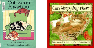
by Eleanor Farjeon
Original illustrated by Mary Price Jenkins, J.B. Lippincott, 1990
Re-illustrated by Anne Mortimer, HarperCollins Publishers, 1996
This is a great example of the difference between pictures that tell a story and pictures that make you go "awww."
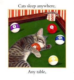
In 1990 Eleanor Farjeon's poem, Cats Sleep Anywhere was published with witty illustrations by Mary Price Jenkins. The pictures extend Farjeon's simple words into the story of a cat lover and her pets.
The cover of Jenkins’ version shows four cats sleeping on and near a green easy chair. Ms. Jenkins
was inspired to illustrate the poem by her own cats who were the models for the cats on
the book’s cover.
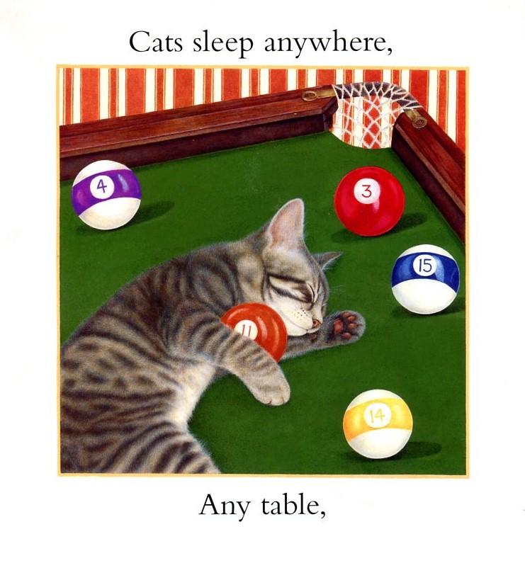
Anne Mortimer's paintings are lovely and would look great framed and hanging on the wall. They'd make nice greeting cards. In fact, according to the jacket flap, Mortimer "illustrates her own line of greeting cards and stationery." Her website says, "Anne's work has been reproduced as home decor products including fabrics, china, collector plates, tinware, needlecraft and stationery."
That's the problem. While Jenkins illustrates the poem, turning it into a story, Mortimer's art is the main feature of the later edition making the poem incidental.
 The back jacket flap in Jenkin's version has two nice paragraphs about Eleanor Farjeon. It tells us that she was born in London in 1881, a daughter of B.L. Farjeon, the novelist and a granddaughter of the famous American actor Joseph Jefferson. After mentioning a couple of her early works it goes on to say that Farjeon was "one of England's most distinguished writers for children....[she] received many awards during her long career. in 1956 the English Library Association awarded Eleanor Farjeon's The Little Bookroom the Carnegie Medal - given for the most distinguished book written by a British subject. For the body of her work, Miss Farjeon was the first author honored with the Hans Christian Andersen award, given by the International Board on Books for Young People...Miss Farjeon died in 1965 at the age of eighty-four."
The two short lines about Mary Price Jenkins mentions that she works and lives in Wales and that the cats on the jacket once shared a house with her.
 Contrast this with the biographical information about Farjeon from the Mortimer version which consists of two sentences, one which tells us that "she was typing stories, plays, and poems by the time she was seven." (emphasis mine)
Anne Mortimer's bio tells us about her line of greeting cards and stationery and that "her painting expertise has been recognized by the Royal Society of Miniature Painters, of which she is a memeber."
The difference in the bios in the two editions really say a lot about the nature of the two books. One is Farjeon's poem brought to life, the other is a cute collection of cat pictures decorated with a sweet little poem.
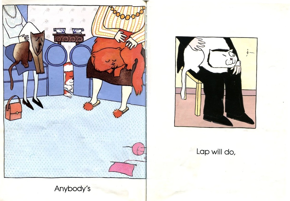
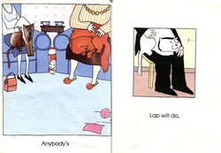 My favorite pictures in the Jenkins' version illustrate the line, "anybody's lap will do." Two ladies visit together over tea. The cats are quite comfortable in their laps. The lady on the right obviously lives in the house. She has slippers on. The lady on the right has a purse next to her feet and must be the visitor. I imagine that the lady of the house was knitting and one of the cats helpfully dragged her yarn out of the way and onto the floor.
There is a male visitor as well. He can be seen with a white cat on his lap. He doesn't mind the hairs that will be left on his black pants. If he did he'd have brushed the cat off of his lap by now. The white cat places it's little paw on the man's hand. Anyone who loves cats will recognize this gesture as one of comfort. Whether it's for the comfort of the cat or of the man, who knows? Who cares?
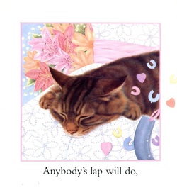 What a beautiful cat Mortimer has painted. We cat lovers recognize that sleepy look as well and can almost feel the warmth of a cat asleep on our lap. But in Mortimer's lovely painting, the person is barely discernible. It could be a chair or a pillow or a bed on which the cat is snoozing.
I must say that the cruder, more cartoonish illustrations of Mary Price Jenkins' book are much more successful than the flashy, gorgeous paintings of Mortimer's edition. Anne Mortimer has given us realism, but Jenkins has given us reality.
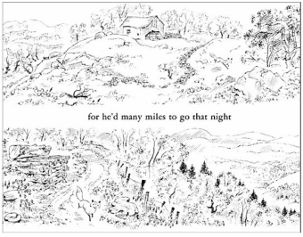
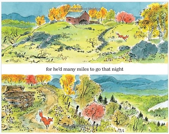
by Robert Frost
original illustrated by Susan Jeffers, E.P. Dutton, 1978
re-illustrated by Susan Jeffers, Dutton Children's Books, 2001
by Joseph Mohr
original illustrated by Susan Jeffers, E.P. Dutton, 1984
re-illustrated by Susan Jeffers, Dutton Children's Books, 2003
Susan Jeffers has been re-illustrating many of her books for the 21st Century. Immediatly identifiable by the new covers, these re-issues have richer colors. Some of the pictures are almost exactly the same, but others are new interpretations of the same scene.
Silent Night is one from the first category. At first glance all that seems to have changed is the quality of printing (richer, deeper colors) and the new gold borders. It's upon closer inspection that we begin to see the differences that tell us these are brand new illustrations. In the first double page spread, for example, Mary no longer holds a white cat and her gown now has three dark stripes on the sleeve.
The most notable difference is in the picture of an angel holding the new born baby Jesus. In the original, the expressive face of the angel looks like a portrait of a real person. The newer angel has a more generic, but no less expressive face. In fact, I think that generic faces, as opposed to those based too strongly on a model, give an artist more of a chance to add the expression necessary for the story.
I could be completely wrong. Perhaps the original angel isn't based on a real face at all. In any case, the re-illustrated scene is wonderful.
The 1984 edition is in the left column below. 2003 revision is in the right column.
by Donald Crews
Original illustrated by Donald Crews, Scribner, 1968
Re-illustrated by Donald Crews, Greenwillow Books, 1986
Who knew? It wasn't until I was digging for more and more examples of re-illustrated picture books
that I found out there was an original Ten Black Dots.
I should have known. As soon ask I picked up the newer edition I saw on the cover these words: "Redesigned and revised!" But I had never seen the original and had a very difficult time finding a copy.
There weren't any to be bought. I finally found a copy through InterLibrary Loan. As you can see, it's well worn.
Click on the covers below to see a slide show of the books.
The two books are very similar. There's only a few minor differences in text and some of the pictures have more detail: the piggy bank now has a face; a snowman is smiling; the rake has some grass to move' the snake is a rainbow of color. The new details add a little bit of life to the simple illustrations. The revised edition has a more satisfying conclusion. It is a counting book, after all, and now we have the black dots arranged in a kind of number line to make for easier counting.
It's interesting that the publisher is still advertising the 1986 edition as "Redesigned and revised!" when there's hardly any copies of the older edition to be found. But now you know.
by Charlotte Zolotow
Original illustrated by Vladimir Bobri, Lothrop, Lee and Shepherd, 1958
Re-illustrated by Ilsa Plume, Harper & Row Publishers, 1988
Re-illustrated by Stefano Vitale, HarperCollins Publishers, 2001
Many of Zolotow's books have been re-issued with new illustrations. I like Vitale's illustrations quite a bit, but I am most drawn to Bobri's work.
Take a look at the text in the three different editions. The first two editions say, "Dogs sleep under beds or in boxes or on rugs near someone they like." Vitale's edition says, "...or on rugs near someone they love". It's interesting to me that the Plume edition is the only one that uses punctuation - although it's only a period at the end of the sentence. The Bobri edition capitalizes the word Dog but doesn't end it with a period. The Vitale edition doesn't even try to make the passage into a formal sentence - no caps an d no punctuation. This is a poem, after all.
Original or Re-Illustrated Version? In this case, the original is best.
written and illustrated by Emily Arnold McCully
Original: 1984
Re-illustrated edition: 2003
Children's librarians everywhere have weeded worn, old copies of Picnic by Emily Arnold McCully
from their shelves because they've purchased the newly illustrated, larger sized version published in 2003. And it's a shame.
Originally published in 1984 as a completely wordless book, Picnic is the story of a mouse family and an outing that goes awry when baby mouse falls out of the back of a truck on the way to the picnic grounds.
In 2003 the book was republished in a larger size, with brand new illustrations and minimal text.
"Now the Caldecott artist has added words and painted bigger illustrations in her signature whimsical style to accommodate a larger-sized read-aloud book," reads the jacket flap.
Interestingly, the illustrations, although completely repainted for this edition (shown in the right side column above), are almost identical to the originals (in the left column ). The colors are deeper and lusher. Not much is lost in the softening of detail. I have to admit that I was happy to see these changes when first encountering this edition. But I am not happy with the other new development. To me, there wasn't any need to add text. The text is superfluous - it adds nothing to the experience of reading the story. I believe that the addition of such uninspired text is actually a dumbing-down of the book.But don't take my word for it:From an interview with Emily Arnold McCully by Scholastic students : "Interestingly, the first wordless book that I created [Picnic] was not intended to be wordless. I simply worked out the story with pictures and a very brief text, and the editor said the text was unnecessary.""...For Picnic, I started out with words, and an editor pointed out to me that the pictures didn't need words. The story could be told through pictures alone."From Horn Book review of the original in July/August 1993: "Picnic is an example of pure, unbridled action, deepened by characterization and emotional truthfulness. In the first few pages a family of mice sets out for a picnic, leaving behind their youngest child. What follows is a brilliantly worked out sequence that has the spontaneous feeling of improvisation. Without such a clear sense of plot and drama, I believe Emily could never have made a wordless picture book so perfectly clear to follow - and so much fun."From Kirkus Reviews in a review of the re-illustrated edition in 2003: "The added words, which are mostly snatches of dialogue or song, are more distraction than enhancement (the original was perfect in its wordlessness)."
|


 RSS Feed